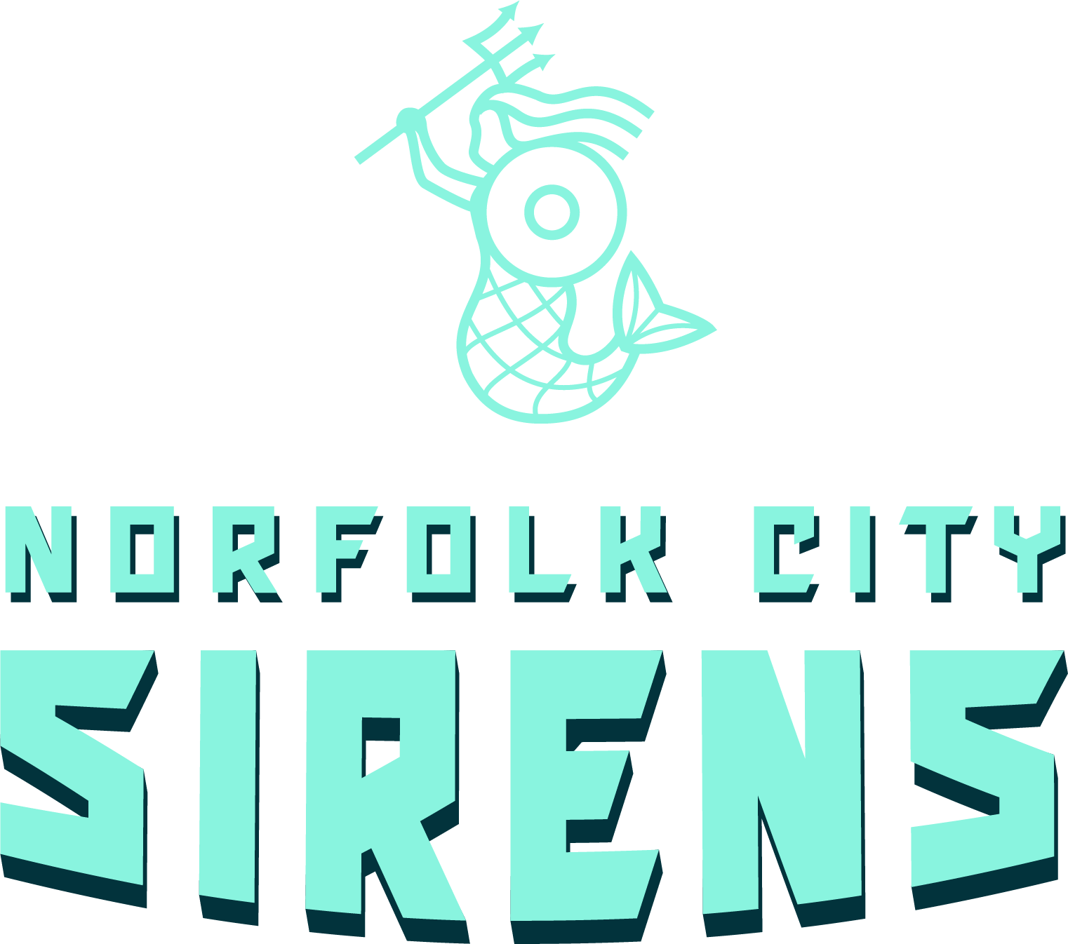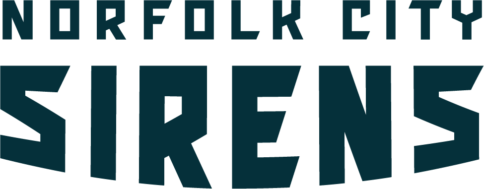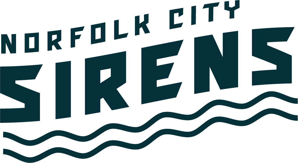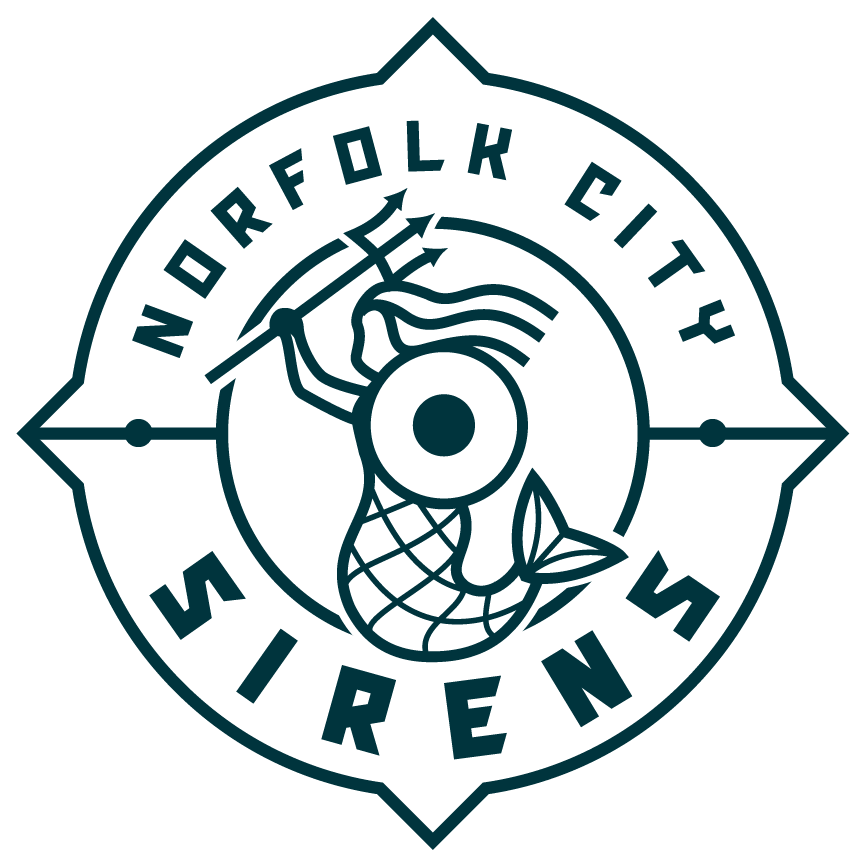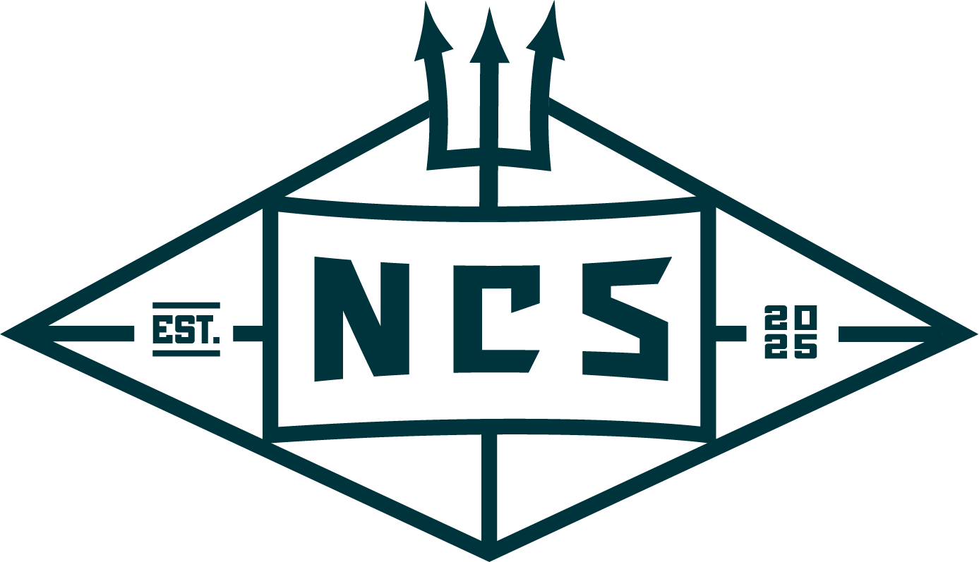
Norfolk City Sirens
SPORTS FRANCHISE | CULTURAL INSTITUTION
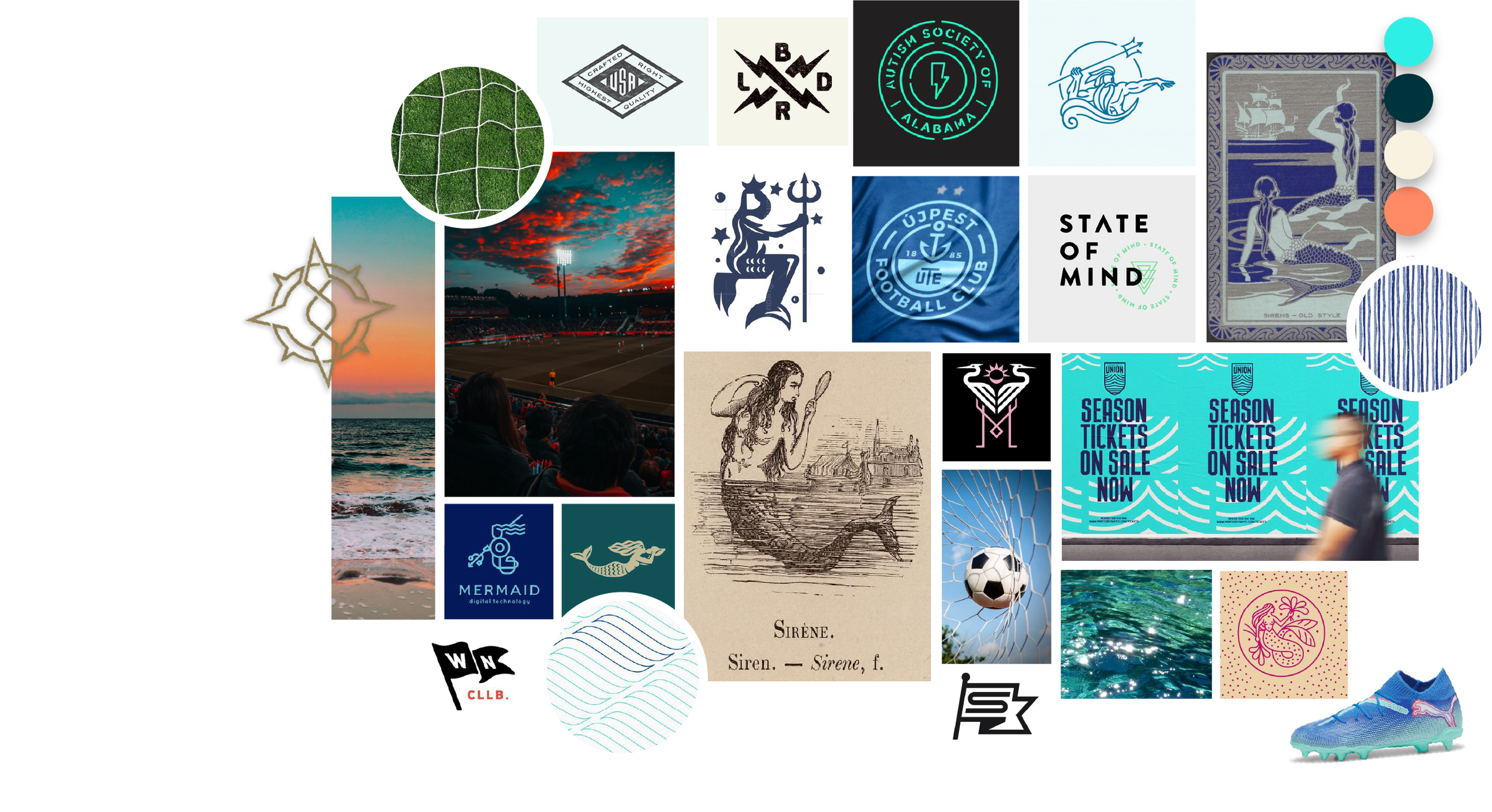
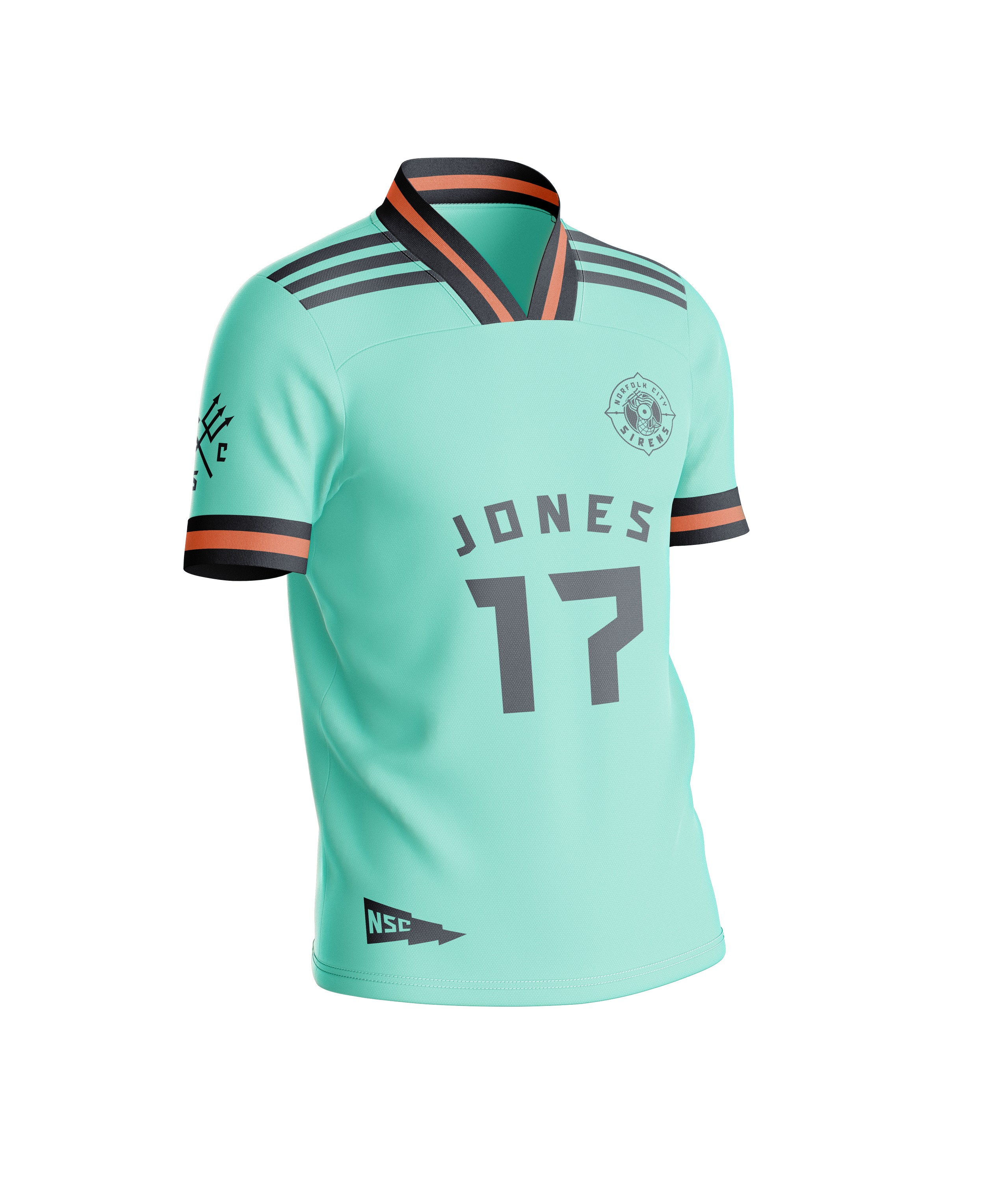
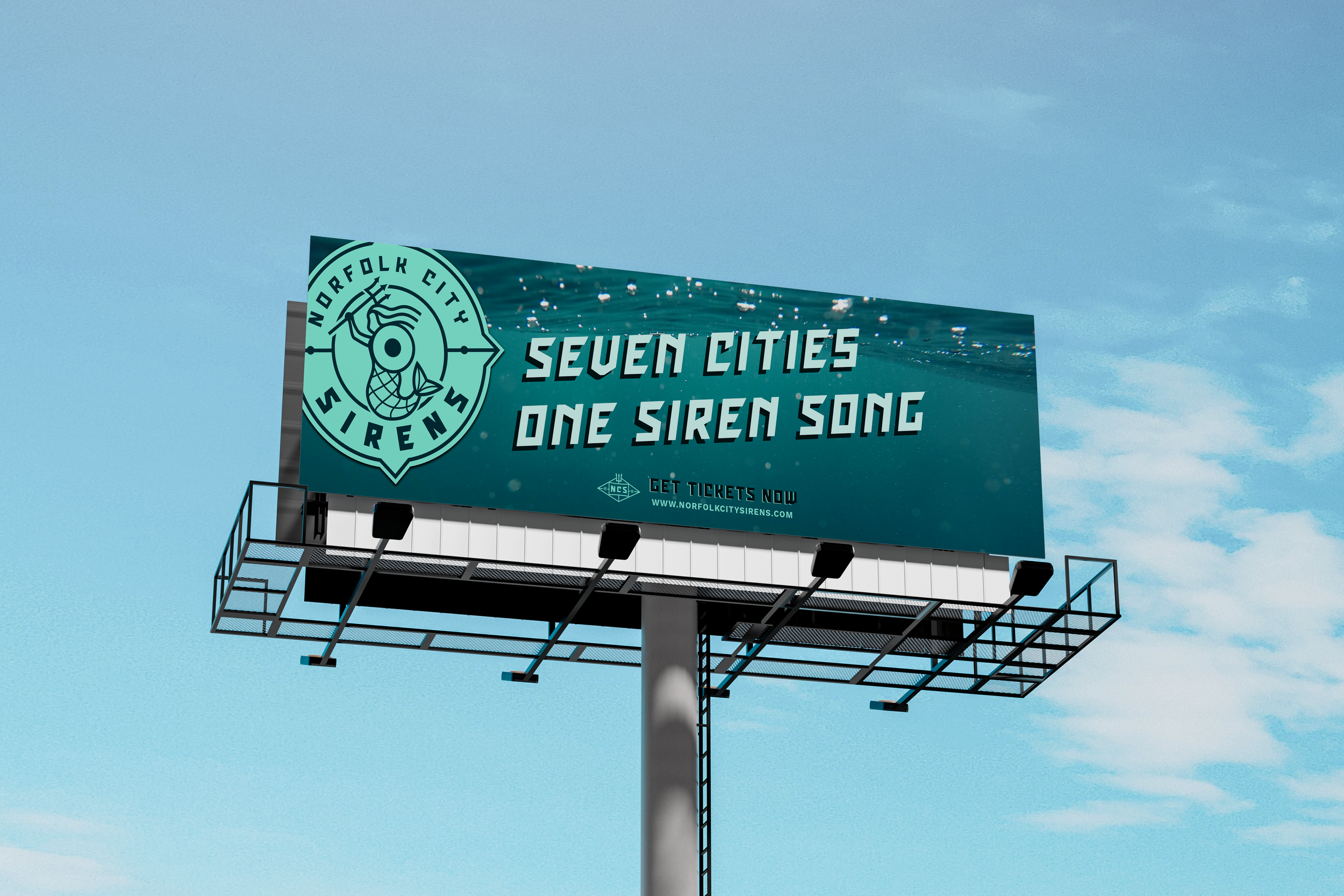
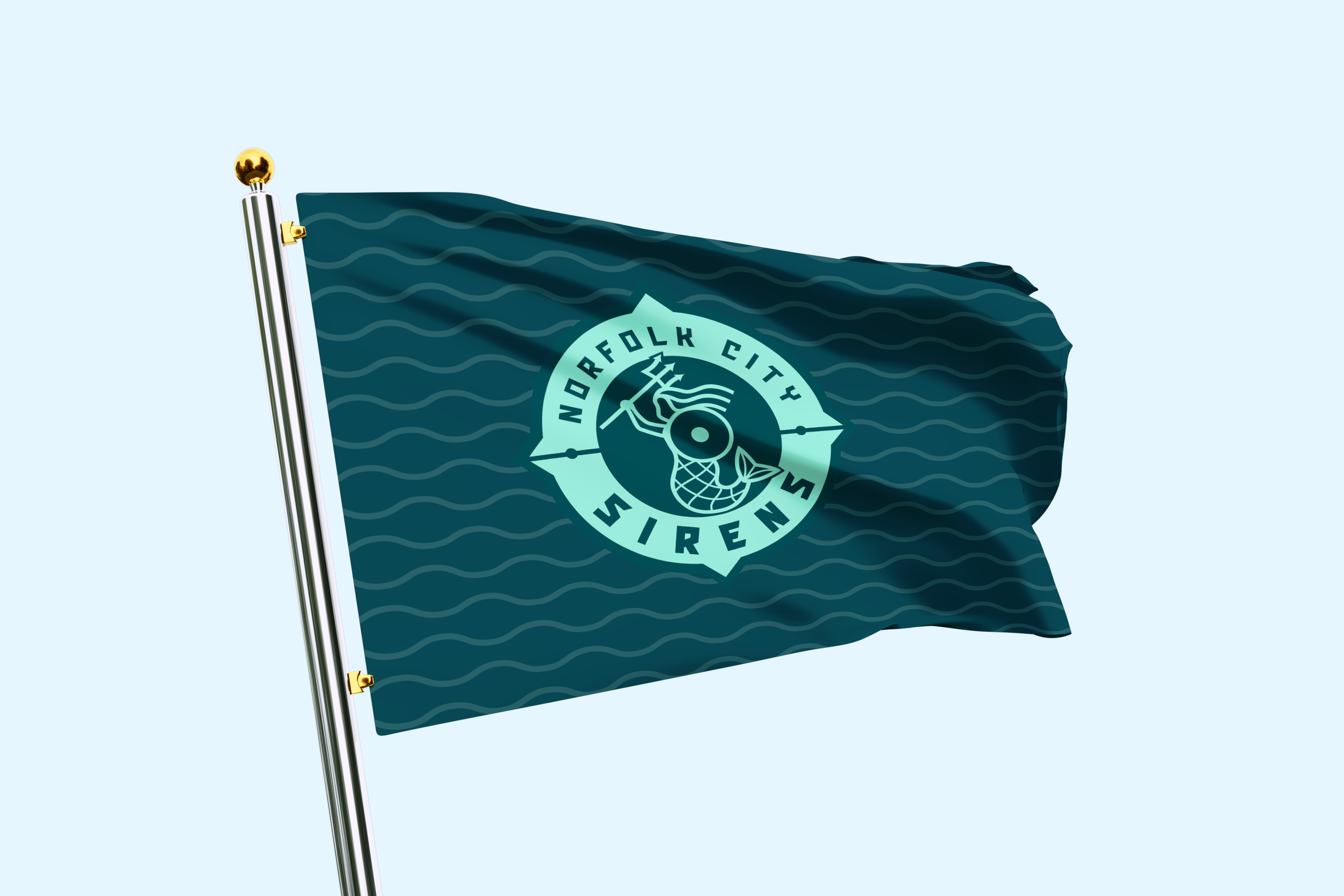
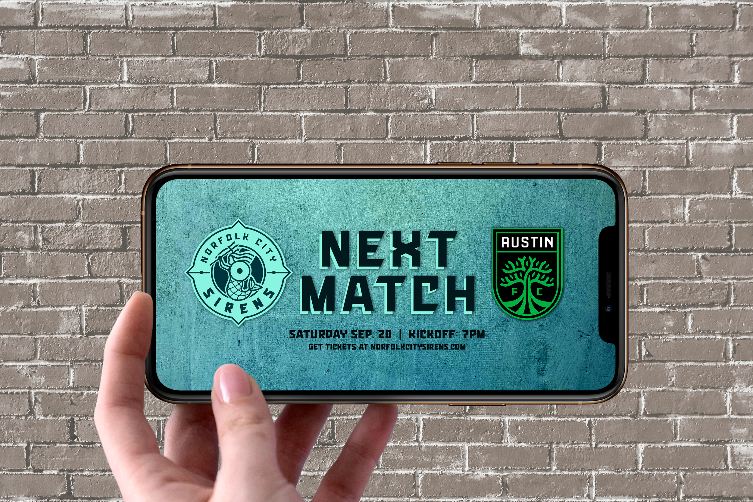
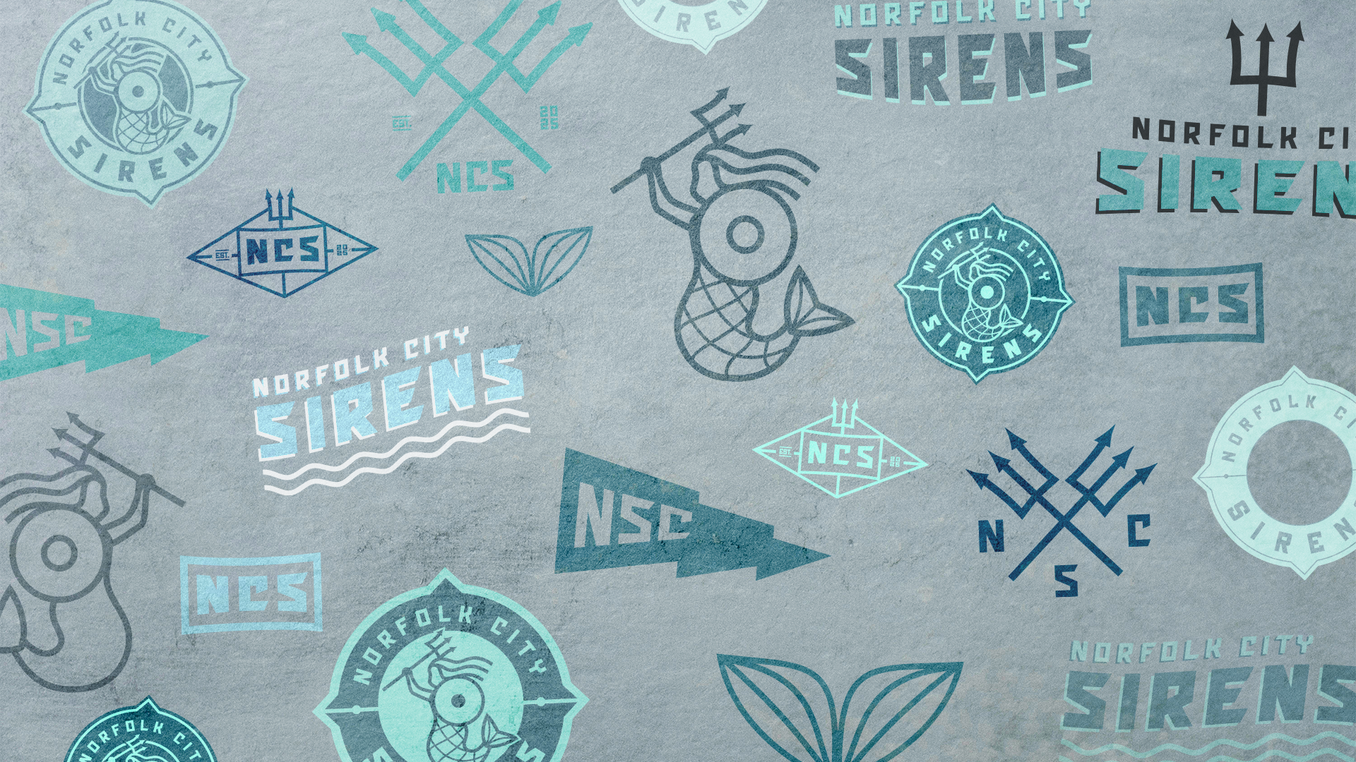
Norfolk is a navy town, a port city, & officially it’s known as the Mermaid City. It felt like exactly the right place for a professional soccer team, & exactly the right brief for building something genuinely rooted in a place rather than generic sports iconography.
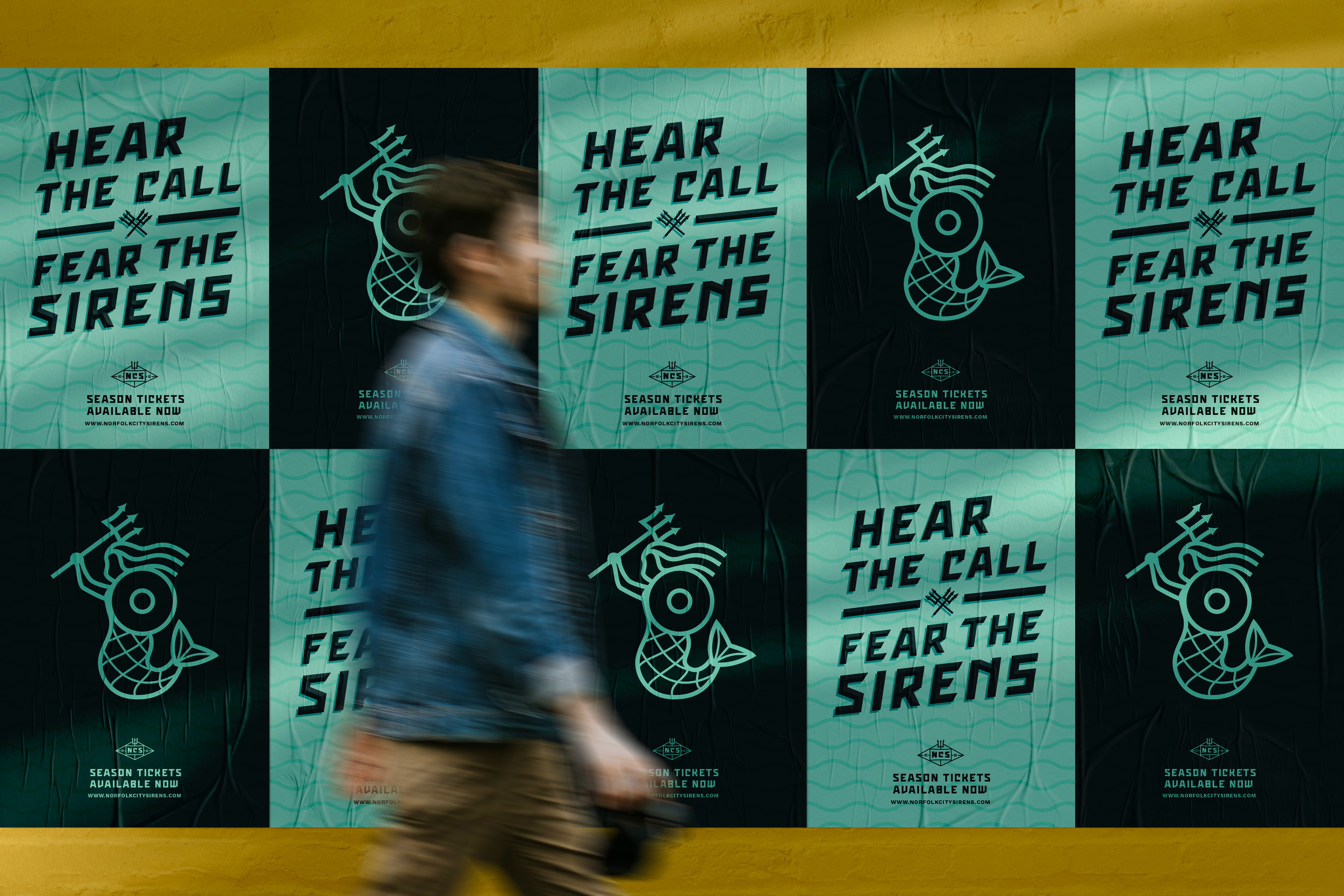
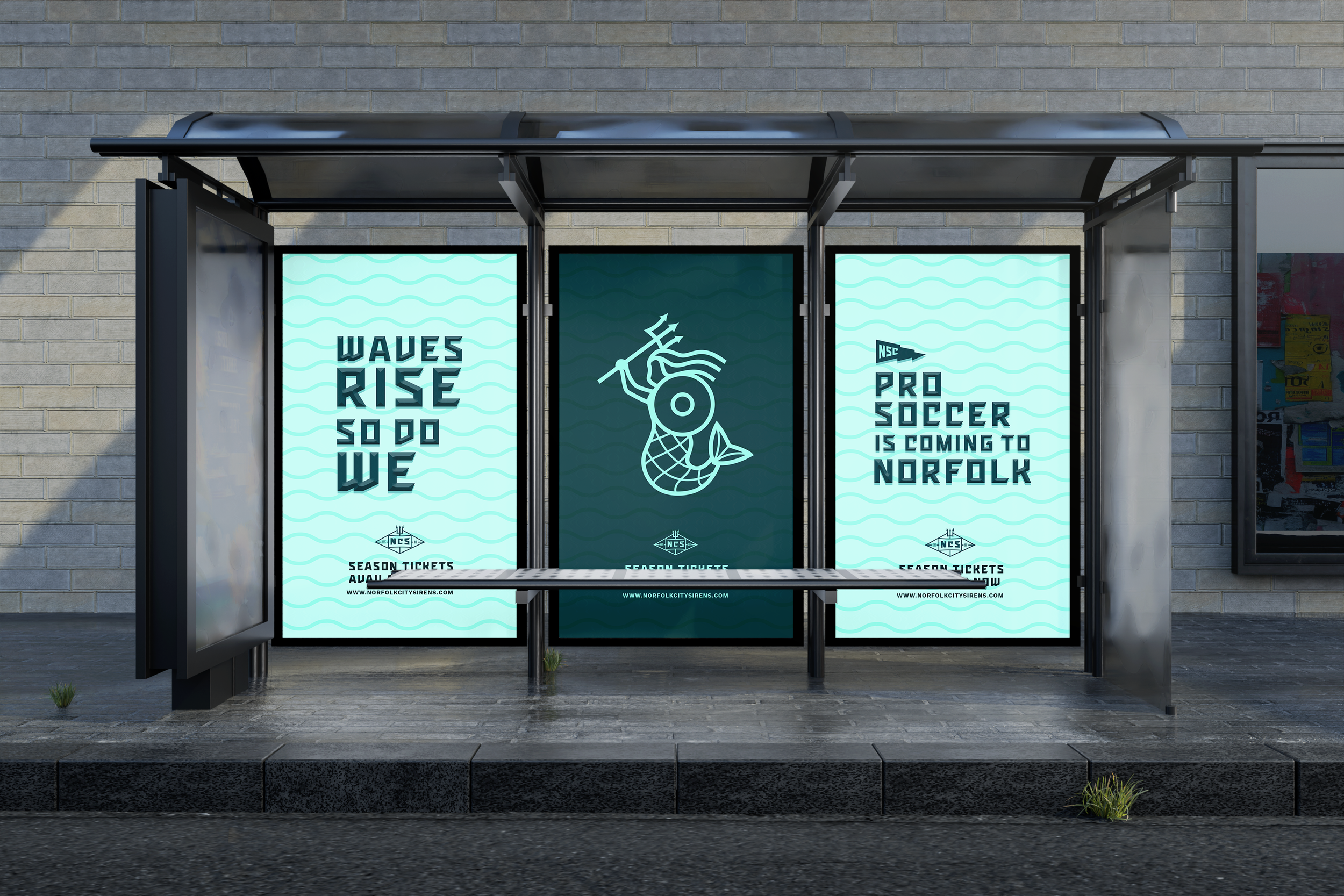
I wanted a brand that would make a new fan base feel something: connected to their city, excited about their team, and proud to wear the kit. The name Norfolk City Sirens came directly from that maritime folklore — a mermaid, but one going to battle, which felt right for a sports team in a way that a traditional mermaid simply wouldn't.
SERVICES
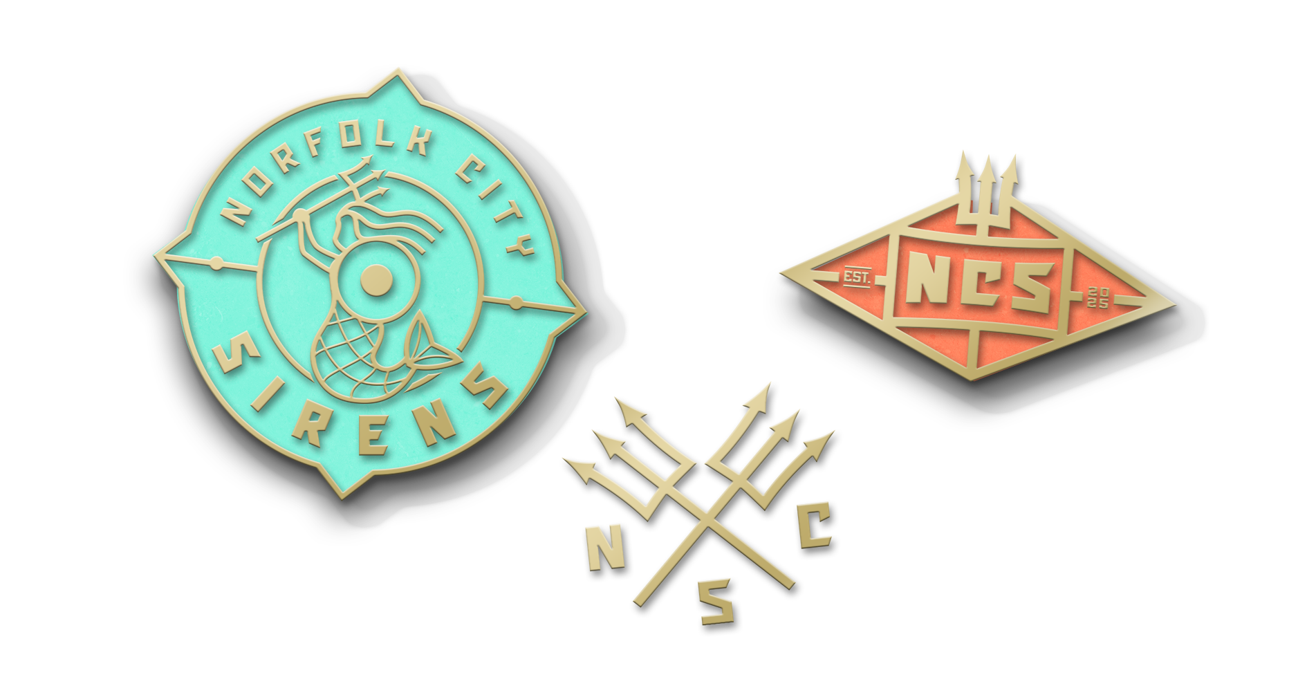
LOGO + IDENTITY
BRAND DEVELOPMENT
NAMING
PACKAGING
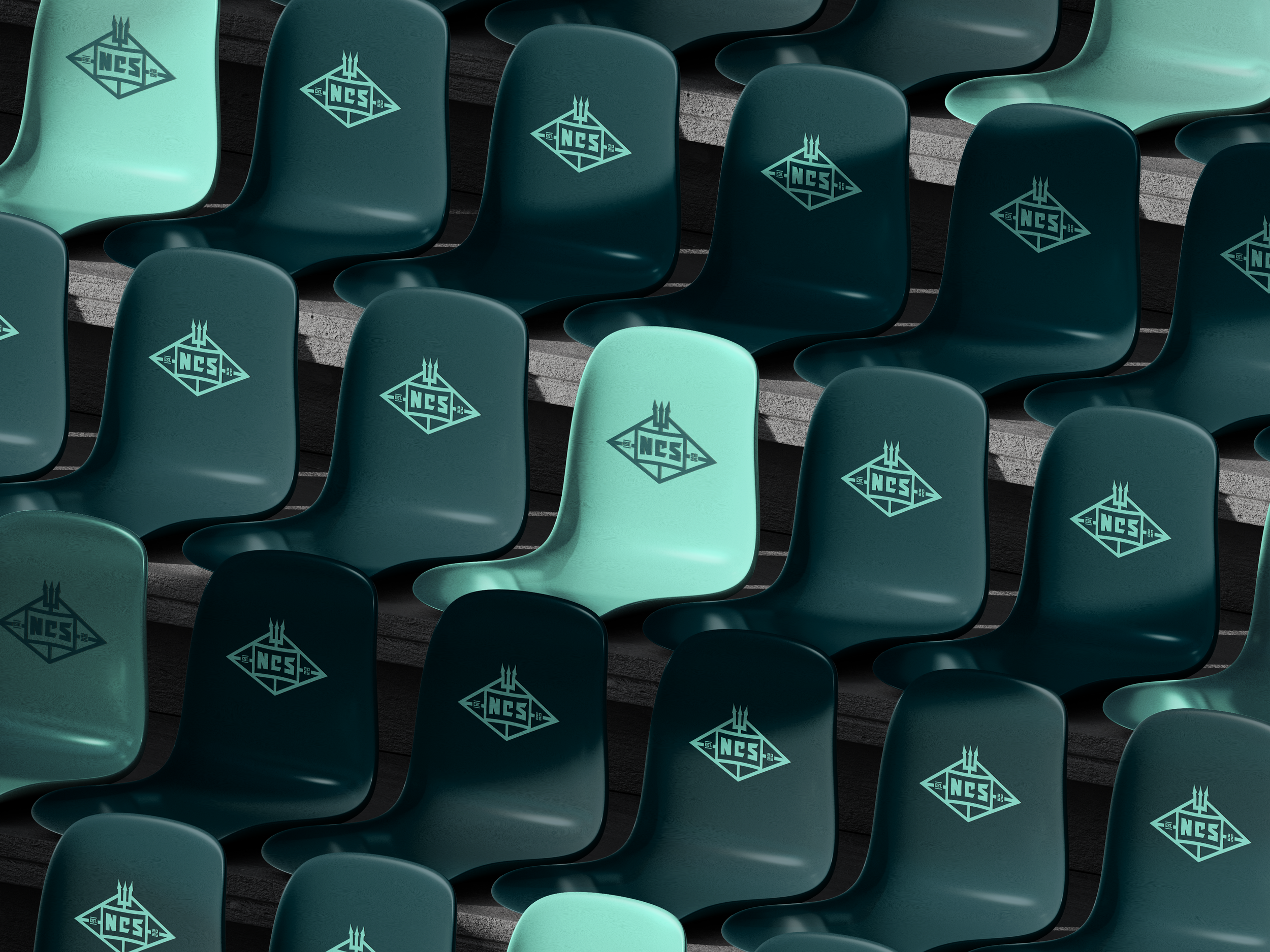
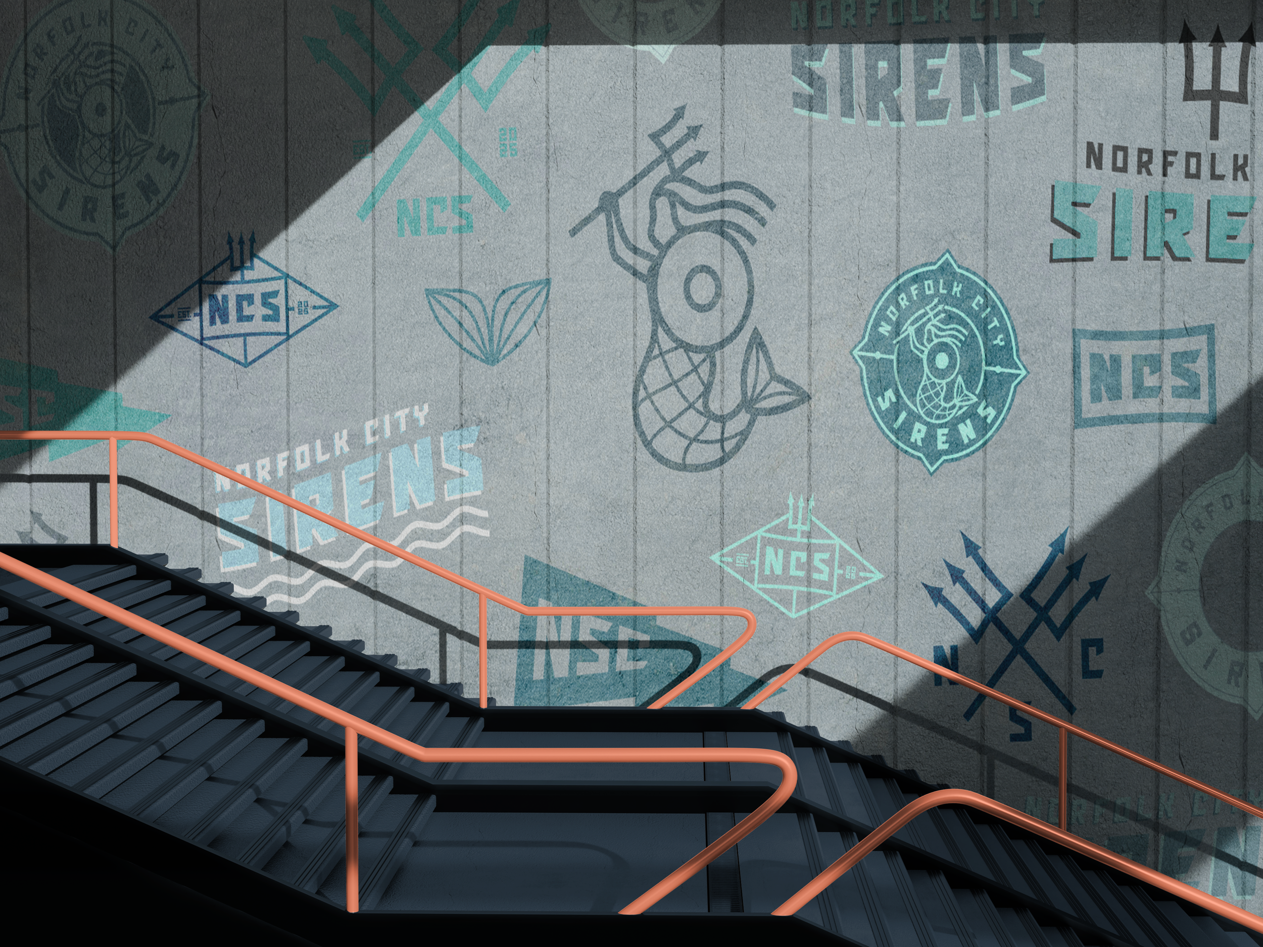
ENVIRONMENTS
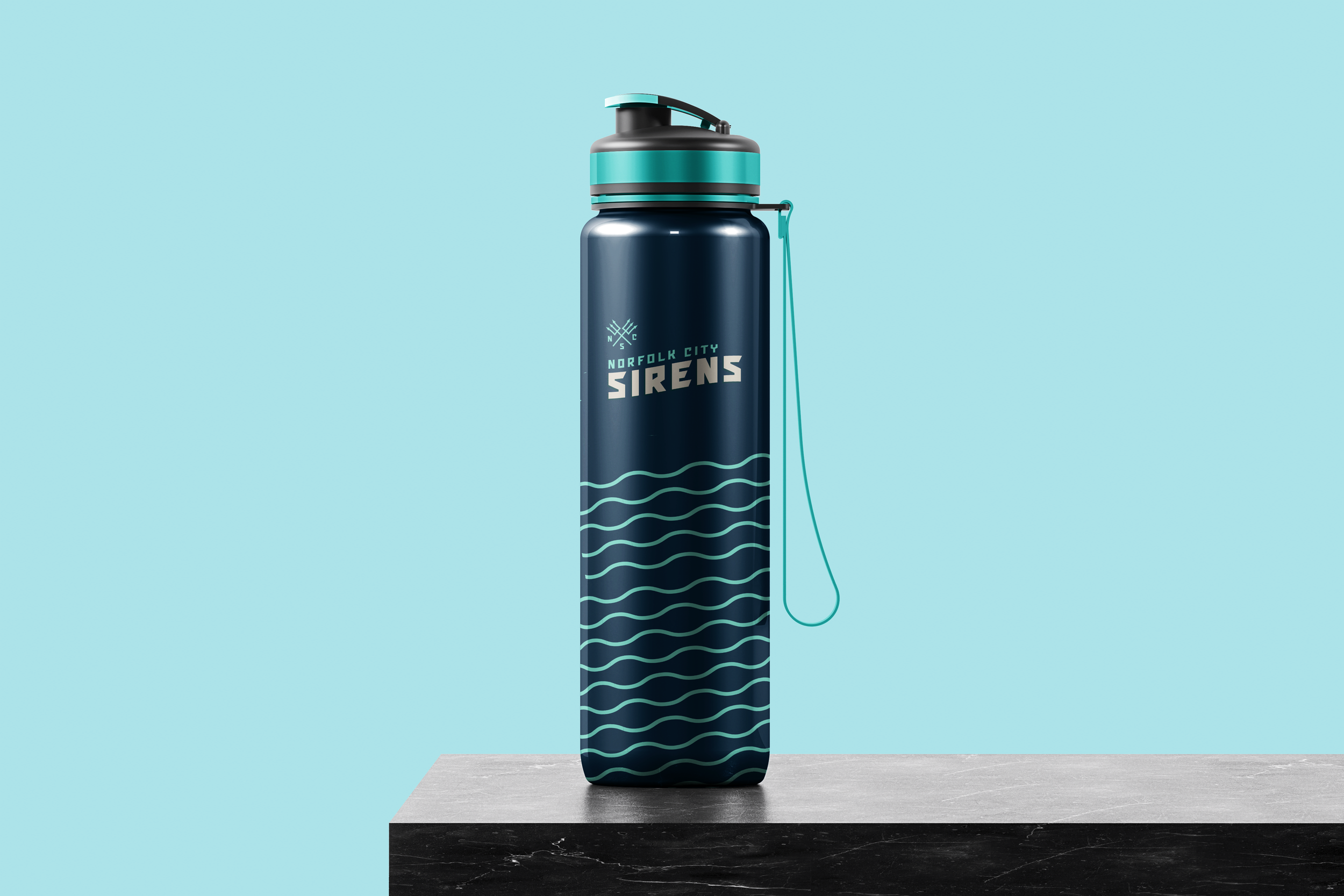
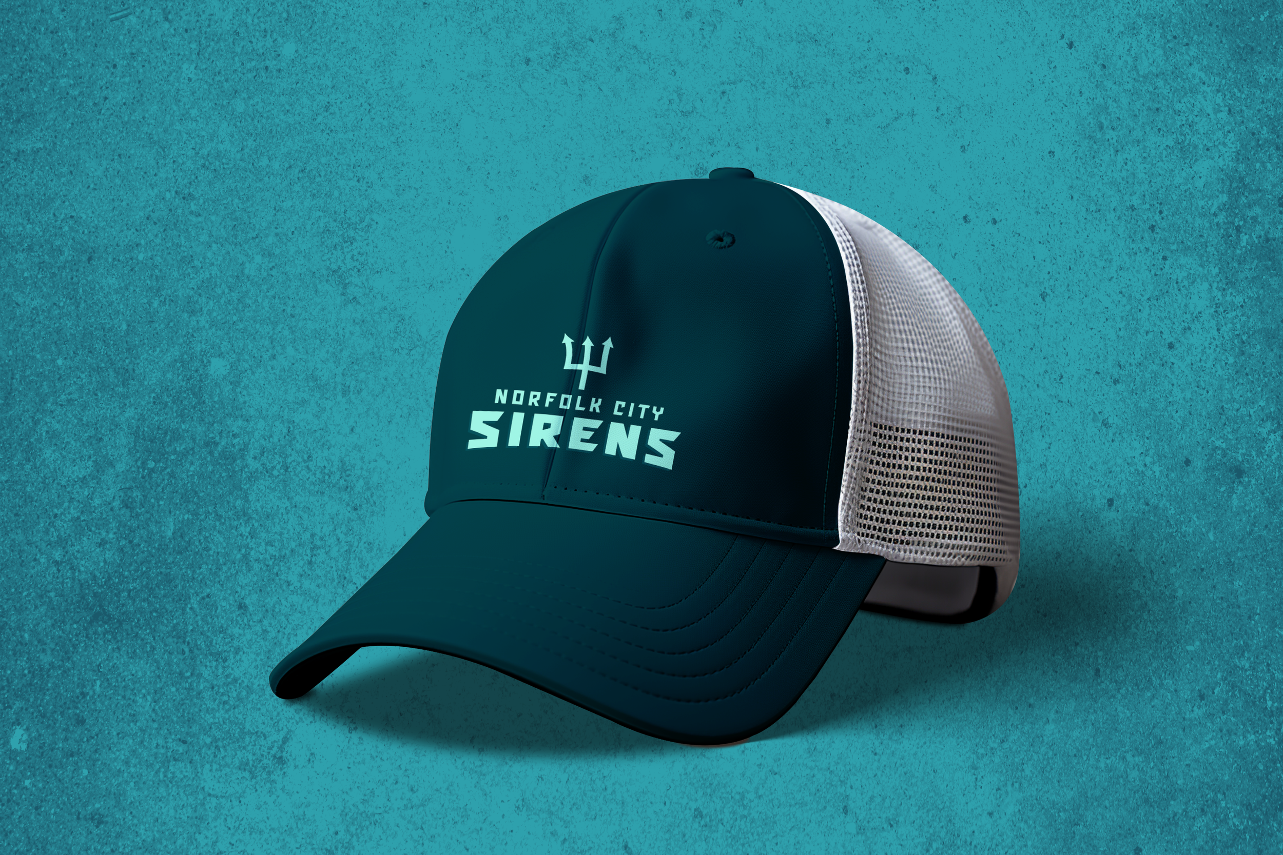
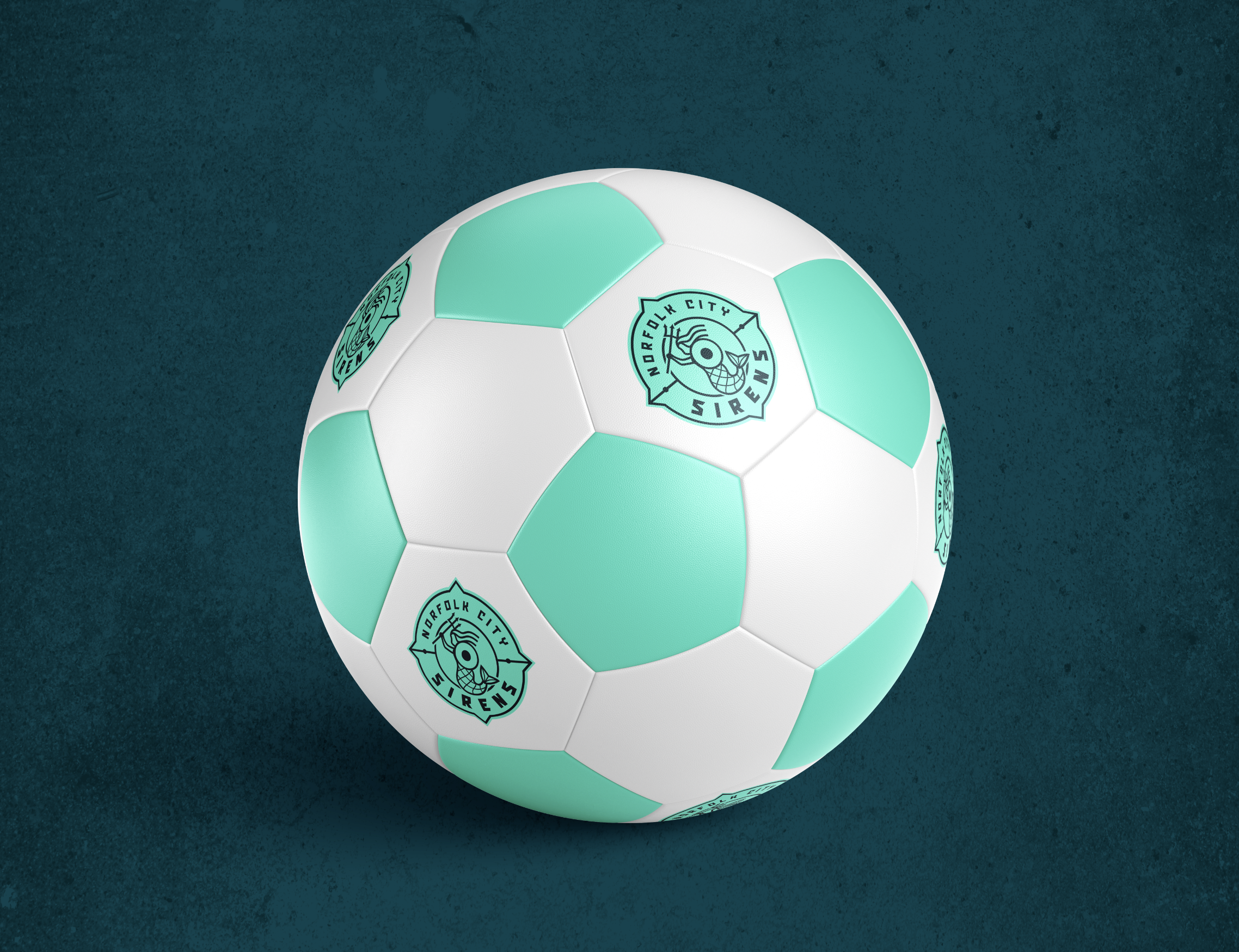
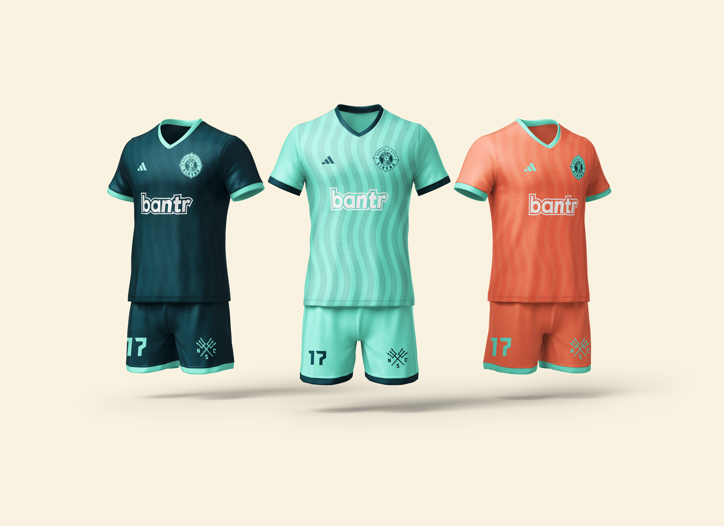
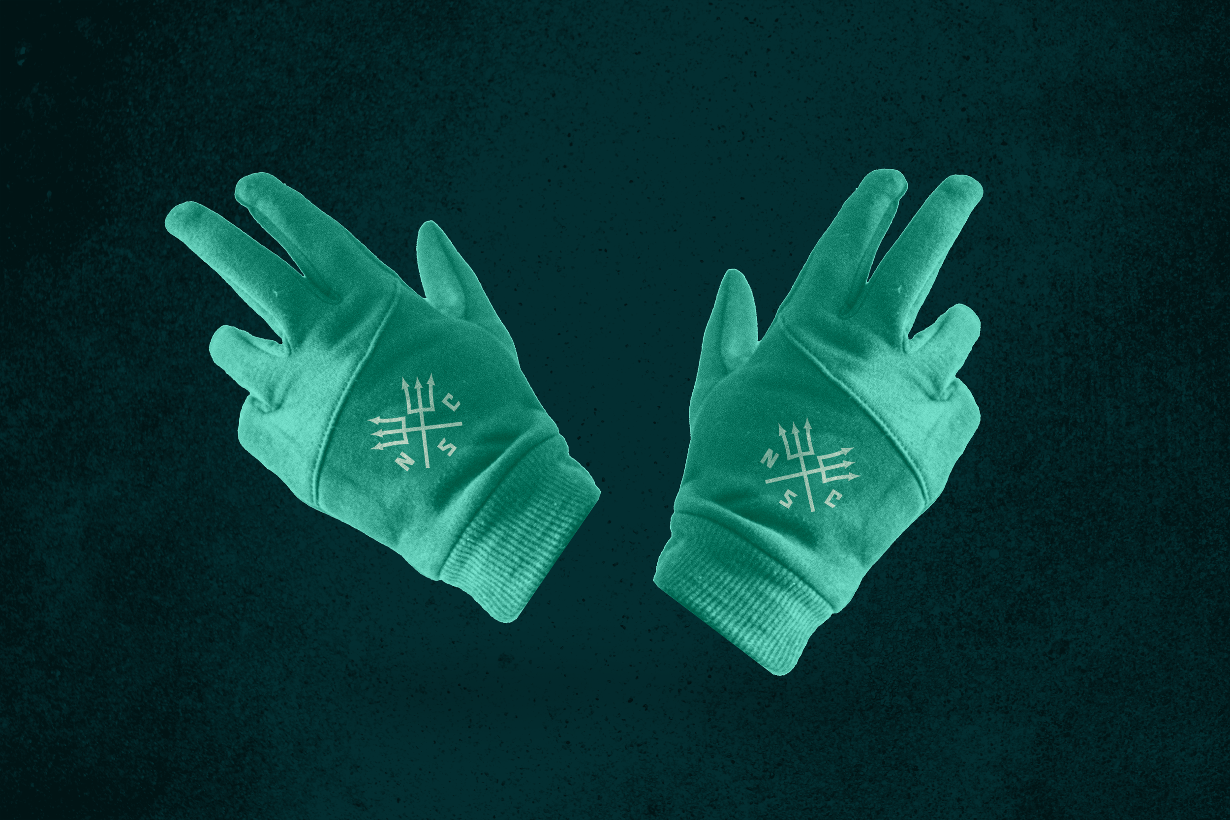
MERCH
*This project is part of my Dream Client Youtube Series. You can watch me make it here!